In the upcoming autumn and winter season, design and colors of our living spaces will be very versatile. This also shows the bright color palette of the Pantone color trends 2018.
Just as in the fashion world, you can find multiple trends in the interior design every year. Trends are becoming more and more individual and are mingling with each other. The consumer puts increasing emphasis on individuality and wishes to meet a growing need for self-expression. This leads to more eagerness to experiment when it comes to design and choice of color.
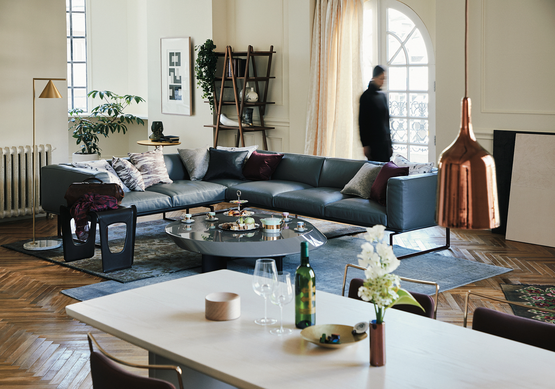
Earth and pastel shades are combined with mild grey, deep blue and green, warm red and tropical yellow shades, with the colors being predominantly soft and the contrasts gentle and harmonious.
These colors are also reflected in this year’s carpet trends: Soft colors, harmonious color transitions and natural fiber carpets are extremely popular. Bold and luscious color shades give variety to plain-colored floors.
NATURAL AND SOFT COLORS FOR AN OASIS OF CALM
This year the trend towards natural styles persists. Due to the increasing digitalization and bustle of our everyday life, we are attracted to more coziness and nativeness for our home. Natural materials and soft natural tones and pastel shades for the interior design are the appreciated contrast to smartphones and tablets.
Washed-out earth tones and nude colors on walls and floors make us slow down and create an oasis of calm. Here, we do unwind and feel good. Combinations of beige or brown tones and the trend colors pink, mauve and antique pink are the most popular.
We also keep on loving soft tones of grey and white in our homes.
SHADES OF GREEN ARE STILL A DESIGN TREND
Apposite to the nature look of the catwalk and the interior design, shades of green continue to be very popular in 2018. This autumn, we particularly fall for khaki, the color of the jungle. A deep green carpet likes to huddle against light and dark floors. Home accessories, cushions and textiles in green or with jungle prints as well as oversized flowers move into our homes.
HOW TO COMBINE THE TREND COLOR BLUE
This year, shades of blue like Aqua and Pigeon Blue join the green tones. Whether as the main color of your interior design or as a home accessory: The shades of the ocean can easily be combined with other color hues. It particularly matches very well furniture made of light natural materials. Green and blue accessories and carpets in front of a blue wall create a completely new personal “feel-good” atmosphere. Be bold and try it!
VIBRANT COLOR TRENDS SET ACCENTS IN YOUR INTERIOR DESIGN
This year, the bright and deep colors, which perfectly match the autumn, are a contrast to the quiet earth and pastel shades. A tropical yellow, warm orange and ochre on interior textiles variegate the home. A mustard carpet in the Pantone color „Ceylon Yellow“ sets spicy accents while designs in the tone “Limelight” are refreshing.
RED TONES: NEWCOMER OF THE AUTUMN AND WINTER SEASON 2018
Intensive red tones are the trendsetters of the autumn and winter season 2018: A dark claret like “Red Pear”, terracotta and deep shades of red mix with the earthy-vibrant color palette.
PURPLE IS THE TREND COLOR OF 2018
The highlight of this year’s designer world is purple. In autumn 2018, it sets accents with two different shades: A bold Ultra Violet and the lilac tone Crocus Petal dispel dull thoughts in bad weather. The shade Ultra Violet has been officially nominated Pantone Color of the Year 2018.